Bolonais: A Bold Display Font for Digital Brand Identity
As a UI designer who builds landing pages, SaaS dashboards, and e-commerce experiences, I choose fonts not just for aesthetics—but for function. Bolonais stands out in my toolkit because it’s a display font that balances personality with purpose. Its rough, hand-crafted texture gives it character without sacrificing clarity—especially at larger sizes on modern screens.
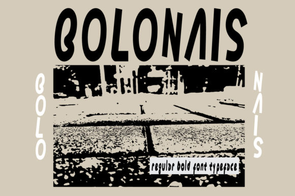
Visually, Bolonais feels both contemporary and tactile. It’s not a script or serif font, nor is it a clean sans serif. Instead, it occupies a distinctive space: a bold, slightly irregular display typeface with intentional imperfections—subtle ink bleed, uneven stroke contrast, and organic terminals. That texture adds warmth and authenticity, making it ideal for brands that want to feel human-centered, creative, or artisanal—not corporate-generic.
Where Bolonais Delivers Real Web Design Value
In practice, Bolonais shines where attention needs to land: hero section headlines, product name treatments, course title cards, and CTA banners. Because it’s designed as a display font, it performs best at 32px and up on desktop, and 28px+ on mobile—never as body copy. I’ve used it successfully in:
- Landing page headers for coaching programs (paired with Inter for paragraph text)
- Online store banners for boutique fashion brands—especially over muted background images
- Portfolio site section titles that introduce case studies or services
- Digital course sales pages, where the headline “Build Your First App” gains memorability from Bolonais’ rhythm
- Social media ad creatives exported as webp overlays—its texture holds up well even at compressed resolutions
On dark mode interfaces, Bolonais retains impact when set in white or light cream—just avoid ultra-thin weights or overly tight letter spacing. Over photography, I apply a subtle semi-transparent overlay (10–15% black) behind the text to ensure legibility without dulling its energy.
Readability & Responsive Behavior
Like all strong display fonts, Bolonais isn’t meant for long-form reading. But within its intended scope—short phrases, branding moments, visual anchors—it supports fast scanning and emotional resonance. On mobile, I always test its rendering across iOS Safari and Android Chrome. Bolonais loads cleanly as a WOFF2 webfont and remains crisp down to 24px on high-DPI screens—provided line height is generous (1.3–1.4) and tracking is opened slightly (+20–40 units).
Its roughness doesn’t interfere with readability because the letterforms remain highly distinguishable—even the lowercase ‘a’, ‘g’, and ‘s’ avoid ambiguity. That’s critical for conversion-focused layouts where users glance, not read. A headline like “Your Ideas, Amplified” in Bolonais stops scrolling behavior more reliably than a generic sans serif.
Font Pairing for Balanced Digital Typography
Bolonais thrives when paired intentionally. Its expressive nature demands restraint elsewhere in the system. My go-to pairings:
- With a neutral sans serif (e.g., Inter, Manrope, or IBM Plex Sans) for body text, navigation, and form labels—creating clear hierarchy and accessibility
- With a warm serif (e.g., Literata or Lora) for editorial sites or storytelling sections—adding sophistication while keeping Bolonais as the voice of brand energy
- Avoid pairing with other decorative fonts—no scripts, no distressed sans serifs, no competing textures. Bolonais is the statement; everything else supports it.
I also check whether the Bolonais package includes stylistic alternates or small caps—these add flexibility for logo lockups or responsive heading truncation (e.g., showing “BOLONAIS” in full width on desktop, then “BOL” + icon on mobile nav).
Licensing & Practical Integration
Bolonais is a commercial font, and licensing matters—especially if you’re building templates, client websites, or digital products for resale. Most licenses cover web use via @font-face embedding, but verify whether your plan includes unlimited domains, SaaS redistribution rights, or template resale permissions. For client work, I always confirm license scope before delivery—particularly for online stores using Shopify or WooCommerce themes where font assets may be bundled into theme files.
File formats matter too: WOFF2 is essential for performance, and having OpenType features (like ligatures or contextual alternates) expands design control in Figma or Webflow. If multilingual support is needed—for European languages or basic diacritics—I double-check the character set before committing to Bolonais for global-facing sites.
When to Reach for Bolonais—And When Not To
Reach for Bolonais when your brand tone calls for confidence with character: creative agencies, indie makers, wellness practitioners, design educators, or sustainable product brands. It strengthens identity in places where typography does heavy lifting—logo wordmarks, app splash screens, email header graphics, or branded PDF reports.
Step back from Bolonais when the context demands neutrality, speed, or universal familiarity—like financial dashboards, medical portals, or enterprise admin interfaces. And never force it into buttons smaller than 16px or form fields; its texture loses definition there. Reserve it for moments where your audience should *feel* something—not just process information.
In short, Bolonais isn’t just another creative font. It’s a deliberate tool for shaping how users perceive your digital presence before they read a single sentence. Used with intention—as part of a considered typographic system—it reinforces trust through consistency, lifts engagement through distinction, and anchors your brand identity across every pixel it touches.